Ack, Mr Ploos. . . up ta me neck in moon rivers keepin' me cool while surrounded by the local characters . . . Hahahahaha.Originally Posted by eighty+

Well, let's not stand on ceremony -- everyone into the drink says I so I can sick Nessie on 'em.

 Senior Member
Ack, Mr Ploos. . . up ta me neck in moon rivers keepin' me cool while surrounded by the local characters . . . Hahahahaha.
Well, let's not stand on ceremony -- everyone into the drink says I so I can sick Nessie on 'em.
"Not a bit is wasted and the best is yet to come. . ." -- remembered from a dream
Senior Member
Hi Mac How does this 1 look how are my voloumes Yak Yak Yak

Senior Member
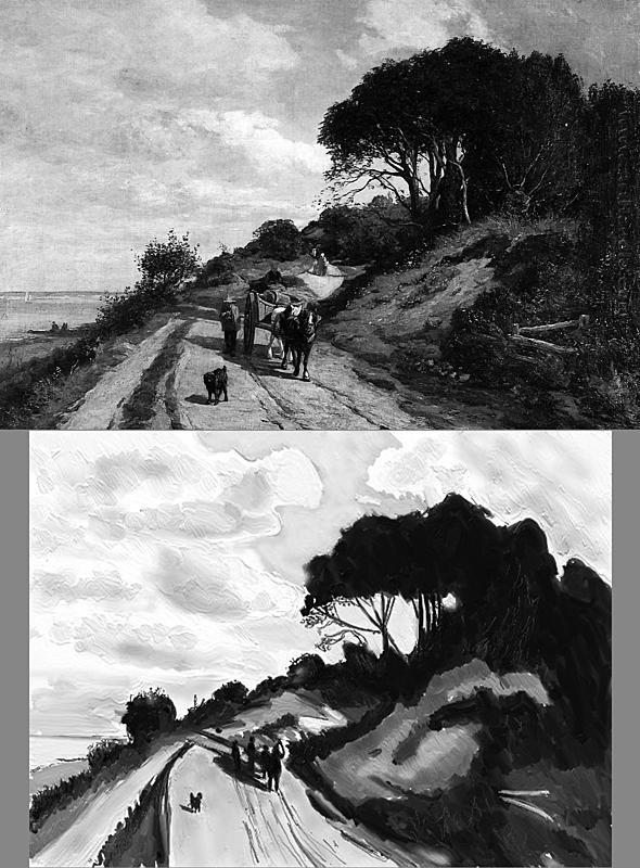
Well, hard to know what painting you're copying. Could you give a link or the title or the artist of the original. That way I can see what you're looking at. It would be easier to make a comment on your values.
Right now, without seeing an original though, I can comment on the picture as if it were being painted from scratch:
I'm seeing this as something of an under-painting to establish values (a base for building up your picture with color).
Overall it's pretty good because you're making some clear divisions and creating a dark-light pattern as a strong foundation for a composition. So the basic structure is established.
You have a excess of contrast at this point, but if this is just the beginning, you can work the value range more. What I see presently at this stage, you have a lot on the very dark end and a lot of pretty light on the light end. However, there's some mid-range values missing to fill it out. And that could merely be because the painting is just beginning.
Example, in the sky, it looks like you're putting in good information, but in the context of this pic it's missing perhaps some slightly darker grays. That way there wouldn't be such a jump between the sky and the ground.
Anyway, it's a good start and I can see you making the right considerations so far. Consider the mid values more I think. But overall a good start to your thinking.
I'm happy to see you embracing the darks more fully and solidly at the beginning because that will help you know your range when you start mixing your colors.
"Not a bit is wasted and the best is yet to come. . ." -- remembered from a dream
Senior Member
Hi Mac tried to do as you quoted I think
Senior Member
Your characters are starting seaside summer holidays on Your last painting. Fine landscape indeed.
Should You need an inspiration for Your next portrait ... well, here's a quite engaging face to paint!
Panta rei (everything flows)!
Senior Member
That helps. Also shows me you're on the right track. I put these for comparison side by side in BW so you can see the similarities and differences. You done pretty good. Before I saw the original, I had anticipated the sky to be a lot darker when in fact it's light (though a little darker than yours). But you're closer than I thought.
You could probably go around and compare. Not bad though. And of course you can see that when one puts in details it skews the values somewhat (will make it a little darker generally). I think an area to be particularly mindful of is the cast shadow on the road behind the figures. There should be separation between the values there if for no other reason than to make it easier to see what's what.
But I think the best part of all this is that you're solidifying your paint with a lot less white of the paper showing through. I had found that a little distracting when you make it look a little like freehand airbrush. But this is better to my taster and certainly better in the sense of how they painted back then. So you're getting closer to their technique.
Go man go!!!!!!
"Not a bit is wasted and the best is yet to come. . ." -- remembered from a dream
Senior Member
Hail O Caesar O Mighty one Ho Ho Ho Mien gott Vaht a Hooter must be a Pope drinking all the Holy Wine
get off the Road think I'm somewhere in France
Hi Mac How do you get such good picture's my fault as the IPad is a good arms lenth away from my eyes i can see now when I hold it about 6" from my
face ther's two horse's pulling a cart a bloke sitting up top and 1 walking and the big wheel I thought was another bloke further up the road a woman with
a little girl and a basket on her arm up a bit think two more people but not sure could be a couple of your Gophers then down on the beach a couple of
rowing fanatic's so its back on the road for me ok
it could be in Scotland or Ireland ok Thanks Mac for the info sorry to be so much trouble to you
Senior Member
Hi Seno'r Mac cast thou weary eye's on this one and tell me if I've gained a grade coss I've been on grade C- 6 for a long time I'll even bung in some moon river's
and a couple of genuine Aggis as I would like to be a grade C- 5 ok
'
Senior Member
Very respectable Mr Ploos! You made a huge jump with your landscapes. One could always add detail but it's very good.
As a crit: Take care to keep your lights in the warm range as opposed to that rather cool white you're using. That kind of white is in this case less from nature and more for human garments that are bleached white and occasionally in clouds, but less often on the ground. The way he did the lights of the road and highlights on the trees and the fence in the foreground to the right is that they were warmer "whites" that perhaps have a bit of ocher and yellow perhaps a little sienna (wouldn't know till I was mixing the colors but you can pick the color directly from the original painting as a short cut).
The road between the cart and the trailing walking figures is white that makes what you did with the road look like it's part of the man made white as different from the light part of the dirt road. So it flattens that portion of the picture out. You may want to go back in and paint over that bit of road with the lighter earthen colors. Similarly with the vegetation and spindly tree trunk etc to the right. Warm it up a wee bit.
But this is really solid. Love the gradation of the blue in the sky. Your shapes are a lot clearer, obviously, because you can see it in the source pic that I uploaded.
On that point of where did I find it: I took the name you provided and did a Google Images search and it was the first pic that came up. Ordinarily when you do that, it provides an array of the same or similar pics. And then what I often have to do is search for the one with the highest resolution. But like I said, in this case I got lucky. Also there seem to be lots of pics that have nothing to do with the painting. Perhaps I could have included the artist's name as well in the search string. But you get the idea.
============
Below is how to get yourself a bunch of source images based on putting in some key words. This is what I do anyway. And NORMALLY, I get more shots of the same painting. But in this case it didn't come that way. The good news is that it was a really good shot. Happy hunting!
Your stuff is looking grand, laddie.
Last edited by D Akey; 07-10-2013 at 08:58 AM.
"Not a bit is wasted and the best is yet to come. . ." -- remembered from a dream
Senior Member
Mr 80+, great landscape, more please
 Posting Permissions


 Reply With Quote